Role of Visualisation in Big Data World
Info: 8800 words (35 pages) Dissertation
Published: 9th Dec 2019
Table of Contents
The Role of Visualisation in Big Data World
Best Practices from Visualisation
Visualisation’s Methods and Techniques
Other Visualisation Element: Interactivity
List of Figures & Tables
Figure 1: The Visual Analytics Process
Figure 2: 4Vs of Big Data and how Visualisation fit in them
Figure 3: World’s biggest cash crop, an example of a bar chart
Figure 4: The Inflation-Adjusted Income of a Typical California Household, an example of Line Graph
Figure 5: Visualisation Explorer for Major Film in 2016
Figure 6: Visualisation using 3D scatterplots in SpotFire
Figure 7: The Billion Dollar-o-Gram 2013, an example of TreeMaps
Figure 8: Different Types of Cars and its attributes, an example of PCP graph
Figure 9: Tag Cloud Examples……………………………………………
Figure 10: Example of Tag Cloud in (a) sequential, (b) Circular, (c) clustered…………..
Figure 11: Online version of Box Office Receipts over the past 20 years………………
Figure 12: Printed version of Box Office Receipts over the past 20 years……………..
Figure 13: Interactive Mechanism of Data Visualisation…………………………
Figure 14: Zooming method in Maps………………………………………
Figure 15: Overview + Detail interaction in signal processing……………………..
Figure 16: Focus + Context Interaction in London Tube Map……………………..
Table 1: Business Analytics Evolution and its Application of Visualisation
Table 2: Empirical-based Research review on the best practices of each interaction……..
List of Abbreviations
BS: Business Analytics
DS: Data Science
DBMS: Database Management System
HCI: Human-Computer Interaction
UI/UX: User Interface/User Experience
PCP: Parallel Coordinate
Introduction
By 2025, it is predicted that the value of data will increase by 10-fold (Ismail, 2017). Virtually, every branch of industry or business will generate vast amount of data. Thus, the world will experience an aggressive growth and data could be a missed opportunity when not being utilised. And to make matter worse, the rate of collecting and storing data is faster than the ability to use them as a tangible decision-making. With the help of ever-growing technology, visionaries are creating visualisation methods to help turning raw data with no value to an informative data.
In this chapter, some of the roles of visualisation within the big data context will be discussed. Visualisation will also be looked at from the point of view of business analytics and data science. Thus, it will be looking at some of the evolution of data and the accompanying visualisation tools or methods over the decades.
Moreover, this chapter will be looking at some of the best practices of visualisation which includes method and techniques as well as interactivity. An appropriate discussion will be presented on the four characteristics of big data and how it would help visualisation to realised different capabilities. Then, several techniques of visualisation will be presented along with supporting literatures and some examples. Finally, a summary is provided together with the conclusion in the last chapter.
The Role of Visualisation in Big Data World
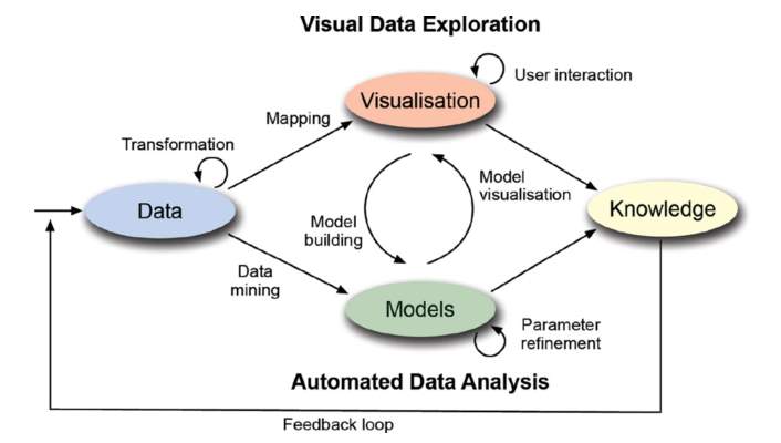
Big data has served a purpose for organisations to optimise their businesses. With an abundant amount of data that organisation generate every day, the ability to turn the data into a decision, effectively and efficiently is crucial. Thus, the knowledge of analytics and visualisation would come hand-in-hand to tackle the problem in big data. Hence, a new interdisciplinary research field of “Visual Analytics” is being established, in which it aim to make the best possible use of the information by combining intelligent data analysis with the visual perception (Kohlhammer et al., 2011). The visual analytics knowledge has been quite useful to the two most common streams of profession in Big Data world, Data Scientist and Business Analytics (Ayankoya, Calitz and Greyling, 2014). Figure 1 below has been constructed to elaborate the role of visualisation through data exploration.

Business Analytics
Data Science
Figure 1: The Visual Analytics Process
Source: (Kohlhammer et al., 2010, 2011)
In the Visual Analytics Process above, the data that have been collected is being transformed according to the streams. For the Business Analytics (BA), the transformed data is being mapped into a visualisation for a user to be processed into a knowledge, usually in a form of decisions, then the knowledge is being feed back into the data for a continuous improvement and to enable analyst to a better conclusion in the future. For the Data Science (DS) stream, the transformed data is being mined in order to build a models that would help certain objectives, the overall approach of the data is problem-agnostic (Bughin et al., 2016). When certain models have been built, it would need to be visualised as well, or vice versa. There is a feedback loop in between models and visualisation in order to get the right outcome for the objectives. Furthermore, the knowledge come from either visualisation or models itself.
In general, visualisation works as a better and faster way to identify pattern or trends and any correlation that would otherwise remain undetected with a text or numbers figure. And visualisation also help to approach problem in a new and creative way that would tap into human’s cognitive brain to understand the information hiding behind a huge number of data. Human can also interact with visualisation, which can be utilised to find more insights or to find the right questions (Schmachtenberg, Bizer and Paulheim, 2014).
Business Analytics
Business Analytics (BA) have become a popular field to study for both academic and business practitioners over the past two decades as university has started offering BA degree and job titled related to BA has increased significantly (Standage, 2012). BA is defined as a data-centric approach that relies heavily toward collection, extraction and analysis tools to enable data to be use as an insight as well as decision-maker, which in most disciplines, is being used by top-management people (Chen, Chiang and Storey, 2012; Davenport and Harris, 2017). Previously, BA was used to report what has happened in the past, although nowadays, with the massive volume of data that can be generated, BA can exploit them to predict the future and make a breakthroughs (Provost, 2013).
Figure 1 has briefly showed how BA utilise visualisation to meet its objectives and it can be seen as vital to the process. Furthermore, the field of BA has been ensued with three evolutions throughout many years and with evolution more objectives and goals were realised (Chen et al., 2012). Therefore, table 1 has been constructed to see the evolution of BA and some of the activities within scope of visualisation which has helped BA in realising its goal.
| Evolution | Application/Objectives |
| 1990’s
BA 1.0 Structured Content |
|
| 2000’s
BA 2.0 Unstructured Content |
|
| Recent years
BA 3.0 |
|
Table 1: Business Analytics Evolution and its Application of Visualisation
Source: Own Elaboration
From the table above, we can see that in the first evolution, visualisation was mainly used to report what happened in the past, as the amount of data that collected through Database Management System (DBMS) were not as big as what you would have nowadays. Dashboard with performance metrics were one of the most popular type of visualisation, followed by Scorecard which help analyse company’s performances (Chang et al., 2009). The second evolution came with a bigger and less structured data, which comes from a HTTP-based web 1.0 systems, characterised by web search engines such as Amazon and Yahoo and other e-commerce business (Chen, Chiang and Storey, 2012; Ayankoya, Calitz and Greyling, 2014). Essentially, with more data points, business analyst was able to collect and gather more information that are relevant to their businesses and use visualisation to predict future behaviour. Visualisation in the second evolution of BA were also used to help developing an efficient and well-integrated DBMS. In illustrating the relationship, coming back to Figure 1 where the there is a feedback loop between “knowledge” and “data” stage. It is crucial for the knowledge to be a product of intelligent analysis techniques and visualisation so that when it is being feed back to the database, it will be able to achieve an optimal result.
The third evolution in the recent years showed a new research opportunity that can be utilised. Since 2011, the number of mobile phones and tablet surpassed the number of laptop and PCs for the first time and the amount of data that those devices generate are massive and very complex (Standage, 2012). And the Gartner Hype Cycle believes that more opportunities emerge in the area of visualisation which includes huge volume of data that require the appropriate usage of automatic data analysis such as clustering or classification before the visualisation process (Gartner, 2017). Human-Computer Interaction (HCI) is another emerging research area within the 3.0 evolution, where it involves designing, and implementing an interactive system that would allow computers to be more receptive toward user’s needs (Kein et al., 2008). Visualisation comes when designing user interfaces (UI) between computers and human, as effective UI that could eliminate barrier between human’s cognitive model of what they try to achieve and computer’s understanding of human’s task (Zikopoulos et al., 2012). Some of the consideration of UI should include effective messages and appropriate colour choices.
Data Science
Through Big Data, the need to create a reliable source of information and a business support system has invented a new and widespread business application of Data Science (Provost and Fawcett, 2013). However, the art of data science is multifaceted, it combined the skills of computer science, advanced analytical and statistical skills, and knowledge of methods of visualising data (Davenport, Barth and Bean, 2012; Provost, 2013; Zhang and Huang, 2013). Although there has been no universally accepted definition of Data Science, a literature based study by Ayankoya, Calitz and Greyling (2014, p.193) has showed it is defined as “a set of fundamental principles that support and guide the principled extraction of information and knowledge of data”. Therefore, we will see how visualisation may help data scientist.
As seen in Figure 1, one of the main thing that visualisation can help is projecting a model that data scientist has built to the reader. They usually play with data that has hundreds of dimensions that does not have usual mapping point thus standard visualisation such as bar chart, will not work (Ayankoya, Calitz and Greyling, 2014). Therefore, novel visualisation employing Parallel Coordinates and others techniques, usually used in this type of data. Secondly, visualisation can help the process of Data Mining, which is the process that scientist aim to automatically extract valuable information from raw data through automatic analysis algorithm (Viktor and Paquet, 2005). Visualisation has been found to give benefit for the process and would help the analysis to arrive at the optimal point as it helps to appropriately communicating the results of the automatic analysis which often handed in abstract demonstration.
Best Practices from Visualisation
The use of visualisation to interpret information has been introduced since the 15th century Italian Renaissance, when Florentine architects built a geometry drawing that improve the perceptions of a physical objects, furthermore nearly 200 years ago, William Playfair did the first research on graphs visualisation for looking at data (Tufte, 1990; Davenport, Barth and Bean, 2012; Zhang and Huang, 2013). The study of this field has been around for quite sometimes, although when looking from the big data perspective, it can be quite complicated as the playing field has changed significantly (Saraiya et al., 2006). Visualisation approach that includes traditional method such as, bar, line, and scatter plots are often known to represent small data sets, although there’s been some empirical research suggesting otherwise, it is still far from solving the issue in visualising a far bigger data sets (Saraiya et al., 2006). Therefore, this section will be looking at some of the best practices in visualisation that can be used to represent the information contained in Big Data.
Visualisation’s Methods and Techniques
A poorly chosen technique of visualisation can completely ruin a clear data, thus would affect how the information is perceived by the user. The visualisation-based method has to be able to turn the challenges of the 3Vs and turn it into a “Value”. Figure 2 shows the correlation between all of them.
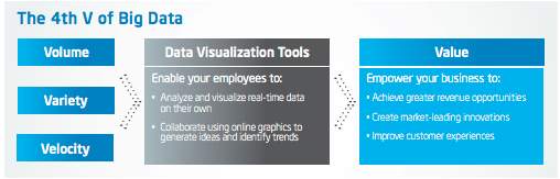
Figure 2: 4Vs of Big Data and how Visualisation fit in them
Source: (Intel IT Center, 2013)
In discussing the four elements, Volume refer to an immense amount of datasets that’s generated from different type of devices, and a good visualisation method should be able to cater to the volume of data. Variety refer the combination of data sources, and the visualisation method needs to be able to combine them altogether to create a tangible value. Whereas Velocity refers to the ability of devices to give data in real time and continuously updating data streams, therefore visualisation method is preferred when able to achieve this task. Lastly, Value in which refer to any opportunities that are able to be realised when the perfect visualisation method is used (Fallis, 2013; Intel IT Center, 2013). Therefore, the chosen methods and techniques of visualisation shown were based on how they able to channel the 4Vs of Big Data accordingly.
Bar and Line Graph
Bar and Line graph are one of the oldest method of visualisation, although it is not quite suitable for big data, it is still commonly used by business analyst as a means to present it to the stakeholders (Kemmis, 2016). Starting with a bar graph, which is a powerful tool to measure associated discrete items in category (Few, 2006). Few (2016) added that it enables a user to emphasis on the individual values and compare it to another by simply comparing the height of the bars. As bar graph emphasis on individual value, they also make it easier to compare to adjacent value. An example in Figure 3 show a bar graph showing gross domestic product from IT and Service Industry of the UK relative to its GDP. Bars is preferable to lines for encoding the data within the interval scale, where the time series divided over a period of years and it is intended to support the comparison between the individual values.
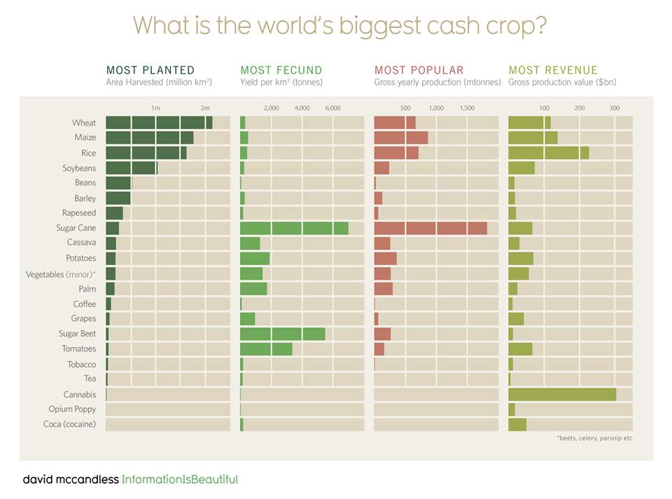
Figure 3: World’s biggest cash crop, an example of a bar chart
Source: (McCandless, 2009)
Moving on to Line Graph which is typically use to emphasise the overall shape of entire series of value (Few, 2006). By having a connected line, it gives the continuity from one value to another. It is very useful to show trend in changes throughout the times. The figure 4 shows how easier it is to read a data through the use of line graph in comparison to bar one.
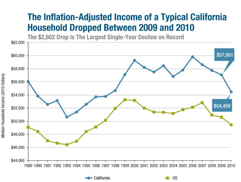
Figure 4: The Inflation-Adjusted Income of a Typical California Household, an example of Line Graph
Source: (LAO, 2011)
Unlike the bar graph, the quantitative scale of line does not necessary have to begin at zero, therefore filling the data region of the graph and making it more detailed and easier to look at. This argument was supported by a study by Schmachtenberg, Bizer and Paulheim (2014) where the respondents finds it easier to spot trends in line in comparison to bar, pie and radar graph. Although, one of the downside is the lack of understanding of the data besides spotting a trend (Philip Chen and Zhang, 2014). Furthermore, due to its simplicity, line chart is mostly used by business analyst rather than data scientist.
Before continuing to other type of method, it is worth mentioning that there are quite a lot of empirical research in regards to the effectiveness of bar, line and pie chart. In a study by Saraiya et al. (2006) shows that pie chart failed at every aspects of communication to the viewers. The argument shows that, human’s visual perception does a poor job in recognising and efficiently comparing 2-D areas and angles, which pie chart represent. Therefore, it is best to use either bar or line to represent the data and to get the information across.
Scatter Plots
Scatter plot emphasis on correlation between data, where user can see whether or not, two or more sets of quantitative values are correlated in certain direction in a certain degree (Kanjanabose, Abdul-Rahman and Chen, 2015). It is also very useful in determining trend in the data and identify the any outliners or outcast. Outliners is a data value that behaves differently from other member within the data sets. As seen in Figure 5, as it shows the correlation between film and their actual budget, % of budget recovered, and critics review within the year of 2016. Although, this is not a typical trend data that’d be more likely to see in business environment but, one can clearly see that most films are in the hit to break-even y-axis and only some of them makes it beyond the megahit threshold, and most of them were in a horror genre.
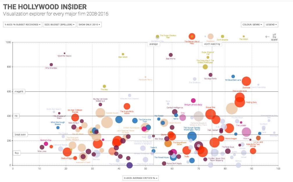
Figure 5: Visualisation Explorer for Major Film in 2016
Source: (McCandless, 2017)
With more data points that can be exploited, scatter plot can be used in a larger and more complex data for data science. Using scatter plot, data scientist can measure the actual values in the raw data and use it against the predicted values of the model, as shown in Figure 6 (Dill et al., 2012). And in terms of the 4Vs, scatterplots have been able to show that it can handle massive volume of data, as well as different varieties of data sources. As for the velocity, Saraiya et al., 2006believes that scatterplots can be exploited to show a real-time data, although it is far from perfect.
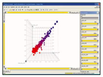
Figure 6: Visualisation using 3D scatterplots in SpotFire
Source: (Saraiya et al., 2006)
Tree Maps
Tree Maps is used to present a hierarchical information which offers many customization features within various of categories (Few, 2006). The founder, Shneiderman, emphasis on the purpose of tree maps, being to spot a particular conditions within a large set of data rather than quantitative comparison or to rank items (Jadeja and Shah, 2015). Jadeja and Shah (2015) added to their survey study that tree maps is popular amongst both business analyst and data scientist as it is very easy to understand and to interpret, an example shown in Figure 7.
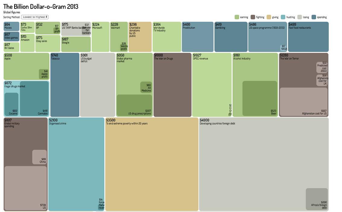
Figure 7: The Billion Dollar-o-Gram 2013, an example of TreeMaps
Source: (McCandless, 2013)
The figure above represent the Billion Dollar spent in the year of 2013, where the value is quite obvious to understand. An empirical study by Long et al., (2017) found that some of the advantages including high efficiency space and high scalability, which means that the method is suitable for large hierarchical structures and the efficiency allow additional graphic data to be combined into the whole tree structure, thus “Volume” and “Variety” of the Big 4s are not an issue. As for the Velocity, tree-map is able to get a real time and interactive as suggested in Information is Beautiful website by McCandless (2013).
Parallel Coordinates (PCP)
This method used plot against many individual data elements across many different dimensions and categories(Lemieux, Gormly and Rowledge, 2014). Lemiux et al., added It is very useful when looking at multidimensional data as it caters to many variables between different axis and data elements, as shown in Figure 8.
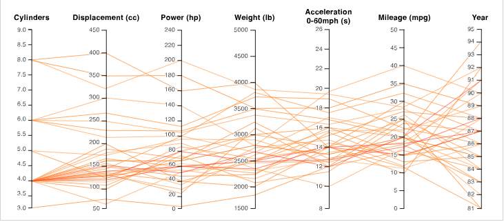 Figure 8: Different Types of Cars and its attributes, an example of PCP graph
Source: (Datavizcatalogue, 2018)
As you can see above, the data represent different type of cars and each car can have its own variables such as cylinders and displacement and each variables axis have different scales. A user-based study by (Kanjanabose, Abdul-Rahman and Chen, 2015) conducted to see how favourable is SC to PCP in the context of multivariate data showed that PCP is more favourable for reading clustering, outlier detection and change detection). Although, some criticism for PCP arise due to its potential of being over-cluttered and not very easy to create in a value (Wickham, 2013). However, this criticism can be reduced by using interactivity and a technique called “Brushing” where it provides a highlight in a selected lines or collection of lines whilst the others can fade out and it will be able to filter other noises (Barlow and Stuart, 2004). Furthermore, PCP ticked all three of V’s boxes as it provides platform for high dense volume, and variety, but also can be used as a real-time platform.
Tag Cloud
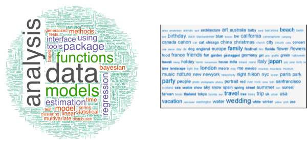 Many of the visualisation tools are used to interpret quantitative data, and not many are able to represent qualitative one. Tag or Word Cloud (TC) is one of the tool that are able to tackle this problem. It is an effective way to evaluate text data and depict it into a word cloud, it is very useful in this day of age where text data through social media and website searches are dominant (Rivadeneira et al., 2007). Most times, tag cloud serves a certain number of most used tag in the defined areas, and the tag’s popularity is shown by the font size (Kaser and Lemire, 2007). Other attributes such as colours, intensity, or weight can be used as further visual properties. Figure 9 shows the two types of tag clouds that are most commonly used.
A B
Figure 9: Tag Cloud Examples, (A) statically clustered tag showing text data related to data analysis, (B) sequential layout with alphabetical sorting showing “most popular tags” in Flickr
Source: (Lohmann, Ziegler and Tetzlaff, 2009)
Most of the empirical studies in regards to the text cloud is comparing them between other types of user interfaces. One of the studies conducted an experiment where the participants could use either tag cloud or traditional search interface to answer given questions and they found that the tag cloud is more preferable when they are open-ended questions (Sinclair and Cardew-Hall, 2008). And they found that tag cloud is not a replacement, per se, but more of a valuable extension to a user interface. Furthermore, a few studies experiment with the tag cloud layout as (Lohmann, Ziegler and Tetzlaff, 2009) displayed three type of layout based on the assumptions of UI are based on two-dimensional grid that divided the interface into a number of horizontal vertical lines thus creating three layout of Sequential (a), Circular (b) and Clustered (c) as shown in figure 10. And they found that when finding a specific tag, user preferred sequential layout with alphabetical sorting, and most popular tags using circular layout, and lastly finding tags belong to a certain topic, user prefer clustered layout. Although it can’t be expressed in real-time (yet), tag layout has given big data a platform to turn a massive volume as well as different type of variety of text data into tangible information that can be exploited.
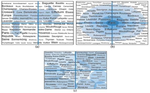
Figure 10: Tag Cloud (a) sequential, (b) Circular, (c) clustered
Source: (Lohmann, Ziegler and Tetzlaff, 2009)
ThemeRiver
This visualisation technique is design to enable the identification of trends or occurrences as well as unexpected occurrences within the themes or topics (Havre, Hetzler and Nowell, 2000). The visualisation was designed to cater multivariate data over a long period of times, and first was designed based on histogram. Both histogram and ThemeRiver (TR) uses variations in width to characterise different variations in strength or degree of representation. However, TR simplify UI of tracking individual themes by providing a continuous “flow” from one data point to another. The commercial use of TR went popular through a New York Times article in 2008 that depict the “Ebb and Flow of Movies: Box Office Receipts Over Past 20 Years” as shown in Figure 11 (New York Times, 2008). It is an interactive visualisation which shows the trends of the amount of money that a certain film makes during the last 21 years’ period, at the box office. The colour scheme can be seen as a representation of the gross income and the length of each shape reveals the longevity of the film in the cinema.
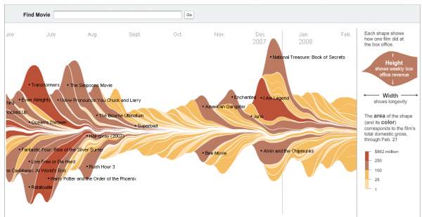
Figure 11: Online version of Box Office Receipts over the past 20 years, an example of ThemeRiver
Source: (New York Times, 2008)
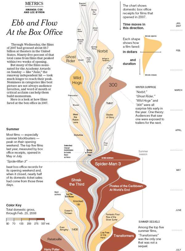
Figure 12: Printed version of Box Office Receipts over the past 20 years, an example of ThemeRiver
Source: (New York Times, 2008)
There has been many reactions and debates over the effectiveness of ThemeRiver to the Big Data world. Many researchers reveal quite positive sentiments toward the technique as it appeals to their aesthetic liking (Muller and Schumann, 2003; Byron and Wattenberg, 2008). A study by Byron and Wattenberg (2008, p.92) which involved a survey of around 50+ people concluded positive and that “the visual appearance of the graph drew people in or kept them looking at the graphic”. Although, this is not always the case, as (Cairo, 2010) explained that through the knowledge of cognitive psychology, human’s brain is unable to handle a very complex graphics of TM without sufficient context. Furthermore, an article wrote by (Neilsen, 2009) criticise a printed version of NYT article (shown in Figure 12) where he raised a number of technical inaccuracy that undermine the accuracy of the data points. Furthermore, he believes that it is quite impossible read the exact values within the graph as there is no axis to use as a reference.
Despite the criticisms, TR has been used extensively in commercial and academic purposes. Although the static version fell short, in dynamic manner, it has been praised by many researchers (Burch, Beck and Diehl, 2008; Fisher et al., 2008; Shi et al., 2012). Thus, in the 3V’s of Big Data, TR has been able to serve big volume, big variety of data and able to be tracked in real-time.
Other Visualisation Element: Interactivity
Often when looking at data, user is eager to learn yet, does not have any sufficient knowledge about the data. Thus for data exploration and analysis of data or information, information visualisation interactivity is crucial to engage the user into reading, analysing and understand the information that has been trying to put forward. Figure 11 shows the interactive mechanism that describes human interaction in different phase of the process (Card, Mackinlay and Shneiderman, 1999).
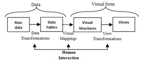
Figure 13: Interactive Mechanism of Data Visualisation
Source: (Card, Mackinlay and Shneiderman, 1999)
As seen above, human interacted within the three main stages within the process, which are during data transformation, visual mappings, and view the transformation. And along those process, there are many ways that data can be “played around” with. Especially in the field of big data as dynamic visualisation is certainly vital in analysing massive volume and variety of data (Khan and Shah Khan, 2011). Moreover, it can be seen in ThemeRiver technique in the previous section where the dynamic one is much more preferable. Below are the techniques in interactivity that can be used in the visualisation;
- Zooming
The simplest form of interactivity is zooming or zoom in zoom out. Sometimes users’ needs to be able to bring the visual in order to see the content. According to (Bumblauskas et al., 2017), in computing, zooming UI (ZUI) in graphical environment, will allow user to change the scale of the area to different level of details without jeopardising their user experience.

Figure 14: Zooming method in Maps
Source: (Shoemaker and Gutwin, 2007)
- Overview + Detail
This technique uses multiple views at one times, which display both an overview as well as the details of a data. This technique is commonly used in maps or through image software. One of the benefit of this interaction is that it stores the overview and to avoid any disorientation in the detail view (Cockburn, Karlson and Bederson, 2008). Figure 2 shows an example a signal processing data, and it gives the assurance of “You are Here” and not to get lost, especially beneficial for looking a massive amount of data sets.
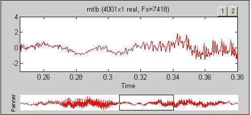
Figure 15: Overview + Detail interaction in signal processing
Source: (Cockburn, Karlson and Bederson, 2008)
- Focus + Context or Fish Eye
This technique tries to integrate both focus and context of the data into a single view where every parts are visible. By displaying all regions into a coherent solitary display, focus+ context interface tries to improve user ability to exploit and manipulate the information through decrease activity of short-term memory load that associated with integrating views of the systems (Cockburn, Karlson and Bederson, 2008). Figure 16 shows the map of the tube in London and how user’s focus is in the fisheye display while the other seems distorted.

Figure 16: Focus + Context Interaction in London Tube Map
Source: (Cockburn, Karlson and Bederson, 2008)
Some of the empirical study based in this area have shown different types of actions that each techniques excel than the others. Therefore, table 2 are some reviews on the studies of Zooming, Overview + Detail (O+D), and Focus + Context (F+T). Furthermore, we can see the experiment indicated in bold and it also shows who excelled in those studies. This can be used as a starting point for best practices of choosing interaction activity that business analyst or data scientist would like to apply to its visualisation method. According to (Cockburn, Karlson and Bederson, 2008), over the top in interactivity is possible, therefore one must know their intention and must choose wisely.
| Author | Description | O+D Zoom F+C |
| Shoemaker and Gutwin (2007) | The study compared the three techniques to do multipoint target acquisition. F+C allowed the fastest task completion. | ✓ |
| Gutwin and Skopik (2003) | Steering tasks where participants must drag through a constrained path. Fisheye were much faster in comparison to the other three. | ✓ |
| Cockburn, Gutwin and Alexander (2006) | Document Navigation was the O+D outperformed the other two as it uses thumbnail- enhanced scrollbars | ✓ |
| Guiard, Du and Chapuis (2007) | The experiment includes a careful analysis of zooming as a tool for a high-index data which needs to be acquired. | ✓ |
Table 2: Empirical-based Research review on the best practices of each interaction
Source: Own Elaboration
Conclusion
Visualisation analytics is an emerging field of research with a unique potential and problems of its own and this chapter of the book has evaluated some of the relevancy to the Big Data world. It starts with some of the roles of visualisation within the two main professions which are Business Analytics and Data Science. We have explained the evolution of visualisation within the context of business analytics. It gave the overview of how technology has changed and how it affected data throughout the different decades.
Then, we looked at some of the best practices of visualisation methods and how it fit the 4Vs of Big Data Characteristics. Most of the methods are suitable for big data although some were favoured by researchers and some fell short. Moreover, interactivity has also been found to be important as part of visualisation, where some methods were able to beautify user interface but also increase their user experience. And in this era of rapid technological expansion, data are moving quicker than ever. Choosing the right tools and methods are crucial to manage the exponential growth of big data. Therefore, researchers and business professionals need to be able to choose the right technologies by considering a wide range of factors.
Reference
Ayankoya, K., Calitz, A. and Greyling, J. (2014) ‘Intrinsic Relations between Data Science, Big Data, Business Analytics and Datafication’, in Proceedings of the Southern African Institute for Computer Scientist and Information Technologists Annual Conference 2014 on SAICSIT 2014 Empowered by Technology – SAICSIT ’14. New York, New York, USA: ACM Press, pp. 192–198. doi: 10.1145/2664591.2664619.
Barlow, N. and Stuart, L. J. (2004) ‘Animator: A tool for the animation of parallel coordinates’, in Proceedings of Eighth International Conference on Information Visualisation. IEEE, pp. 725–730. doi: 10.1109/IV.2004.1320222.
Bughin, J., Manyika, J., Woetzel, J., Mattern, F., Michael Chui, chairman, Lund, S., Cadena, A., Dobbs, R., George, K., Gupta, R., Hazan, E., Labaye, E., Leke, A., Nyquist, S. and Pinkus, G. (2016) The Age of Analytics: Competing in a Data-Driven World. San Francisco . Available at: https://www.mckinsey.com/~/media/McKinsey/Business Functions/McKinsey Analytics/Our Insights/The age of analytics Competing in a data driven world/MGI-The-Age-of-Analytics-Executive-summary.ashx (Accessed: 4 July 2018).
Bumblauskas, D., Nold, H., Bumblauskas, P. and Igou, A. (2017) ‘Big data analytics: transforming data to action’, Business Process Management Journal. doi: 10.1108/BPMJ-03-2016-0056.
Burch, M., Beck, F. and Diehl, S. (2008) ‘Timeline trees’, in Proceedings of the working conference on Advanced visual interfaces – AVI ’08. New York, New York, USA: ACM Press, p. 75. doi: 10.1145/1385569.1385584.
Byron, L. and Wattenberg, M. (2008) ‘Stacked Graphs – Geometry & Aesthetics’, IEEE Transactions on Visualization and Computer Graphics, 14(6), pp. 1245–1252. doi: 10.1109/TVCG.2008.166.
Cairo, A. (2010) ‘One of the worst graphics the New York Times have published – ever!’ – VisualJournalism, VisualJournalism. Available at: http://visualjournalism.com/one-of-the-worst-graphics-the-new-york-times-have-published-ever/2010/03/09/
Card, S., Mackinlay, J. and Shneiderman, B. (1999) ‘Readings in information visualization: using vision to think’, Morgan Kaufmann. 2nd edn. Morgan Kaufmann Publishers, p. 712. doi: 10.1002/wics.89.
Chang, R., Ziemkiewicz, C., Green, T. and Ribarsky, W. (2009) ‘Defining Insight for Visual Analytics’, IEEE Computer Society, 09, pp. 14–17.
Chen, H., Chiang, R. H. L. and Storey, V. C. (2012) ‘Business intelligence and analytics: From big data to big impact’, MIS Quarterly, 36 (4), pp. 1165–1188. doi: 10.1145/2463676.2463712.
Cockburn, A., Gutwin, C. and Alexander, J. (2006) ‘Faster document navigation with space-filling thumbnails’, in Proceedings of the SIGCHI conference on Human Factors in computing systems – CHI ’06. New York, New York, USA: ACM Press, p. 1. doi: 10.1145/1124772.1124774.
Cockburn, A., Karlson, A. and Bederson, B. B. (2008) ‘A review of overview+detail, zooming, and focus+context interfaces’, ACM Computing Surveys, 41(1), pp. 1–31. doi: 10.1145/1456650.1456652.
Datavizcatalogue (2018) Parallel Coordinates Plot, Datavizcatalogue.com. Available at: https://datavizcatalogue.com/methods/parallel_coordinates.html
Davenport, T., Barth, P. and Bean, R. (2012) How ‘Big Data’ Is Different, MIT Sloan Management Review. Available at: https://0-sloanreview-mit-edu.pugwash.lib.warwick.ac.uk/article/how-big-data-is-different/ (Accessed: 4 July 2018).
Davenport, T. H. and Harris, J. G. (2017) Competing on analytics : the new science of winning. Boston: Harvard Business School Press. Available at: https://books.google.co.uk/books/about/Competing_on_Analytics.html?id=7NJDLKltepsC&redir_esc=y (Accessed: 4 July 2018).
Dill, J., Earnshaw, R., Kasik, D. and Vince, J. (2012) Expanding the Frontiers of Visual Analytics and Visualization. Edited by P. Wong. London: Springer. doi: 10.1007/978-1-4471-2804-5.
Fallis, A. . (2013) ‘The four V’s of big data’, Big Data, 53(9), pp. 1689–1699. doi: 10.1017/CBO9781107415324.004.
Few, S. (2006) Information dashboard design : the effective visual communication of data. O’Reilly.
Fisher, D., Hoff, A., Robertson, G. and Hurst, M. (2008) ‘Narratives: A visualization to track narrative events as they develop’, in VAST’08 – IEEE Symposium on Visual Analytics Science and Technology, Proceedings. IEEE, pp. 115–122. doi: 10.1109/VAST.2008.4677364.
Gartner (2017) Gartner Reveals the 2017 Hype Cycle for Data Management, Gartner. Available at: https://www.gartner.com/newsroom/id/3809163
Guiard, Y., Du, Y. and Chapuis, O. (2007) ‘Quantifying degree of goal directedness in document navigation’, in Proceedings of the SIGCHI conference on Human factors in computing systems – CHI ’07. New York, New York, USA: ACM Press, p. 327. doi: 10.1145/1240624.1240679.
Gutwin, C. and Skopik, A. (2003) ‘Fisheyes Views are Good for Large Steering Tasks’, in Proceedings of the SIGCHI Conference on Human Factors in Computing Systems (CHI ’03). New York, New York, USA: ACM Press, pp. 201–208. doi: 10.1145/642611.642648.
Havre, S., Hetzler, B. and Nowell, L. (2000) ‘ThemeRiver: visualizing theme changes over time’, in IEEE Symposium on Information Visualization 2000. INFOVIS 2000. Proceedings, pp. 115–123. doi: 10.1109/INFVIS.2000.885098.
Intel IT Center (2013) ‘Big Data Visualization: Turning Big Data Into Big Insights The Rise of Visualization-based Data Discovery Tools’. Intel. Available at: https://www.intel.com/content/dam/www/public/us/en/documents/white-papers/big-data-visualization-turning-big-data-into-big-insights.pdf
Ismail, N. (2017) Data forecast to grow 10-fold by 2025 – Information Age, Information Age. Available at: https://www.information-age.com/data-forecast-grow-10-fold-2025-123465538/
Jadeja, M. and Shah, K. (2015) ‘Tree-Map: A visualisation tool for large data’. Chile: CEUR-WS. Available at: http://ceur-ws.org/Vol-1393/
Kanjanabose, R., Abdul-Rahman, A. and Chen, M. (2015) ‘A Multi-task Comparative Study on Scatter Plots and Parallel Coordinates Plots’, Computer Graphics Forum. Oxford: Oxford e-Research Centre, 34(3), pp. 261–270. doi: 10.1111/cgf.12638.
Kaser, O. and Lemire, D. (2007) ‘Tag-Cloud Drawing: Algorithms for Cloud Visualization’. Available at: https://arxiv.org/pdf/cs/0703109.pdf
Kein, D., Andrienko, G., Fekete, J., Gorg, C., Kohlhammer, J. and Melancon, G. (2008) ‘Visual Analytics: Definition, Process, and Challenges.’, in Information Visualization. Lecture Notes in Computer Science. Bordeaux: HAL.
Kemmis, K. (2016) Data Visualisation -a selection of graphs, CapGemini Consulting. Available at: https://www.capgemini.com/gb-en/2016/05/data-visualisation-a-selection-of-my-favourites-may-2016/
Khan, M. and Shah Khan, S. (2011) ‘Data and Information Visualization Methods, and Interactive Mechanisms: A Survey’, International Journal of Computer Applications, 34(1), pp. 975–8887. Available at: https://pdfs.semanticscholar.org/4ff1/f2fff62e899f4b9f507b2eb4bb297b7febc2.pdf (Accessed: 9 July 2018).
Kohlhammer, J., Keim, D., Pohl, M., Santucci, G. and Andrienko, G. (2011) ‘Solving problems with visual analytics’, in Procedia Computer Science, pp. 117–120. doi: 10.1016/j.procs.2011.12.035.
Kohlhammer, J., Ruppert, T., Davey, J., Mansmann, F. and Keim, D. (2010) ‘Information visualisation and visual analytics for governance and policy modelling’, European Commission: Future Research on ICT for Governance and Policy Modelling : Crossroad – A Participative Roadmap for ICT Research in Electronic Governance and Policy Modelling. Available at: https://d-nb.info/1096195631/34 (Accessed: 1 July 2018).
LAO (2011) Industry Wage Growth in California [EconTax Blog], Legislative Analyst’s Office of California. Available at: http://www.lao.ca.gov/LAOEconTax/Article/Detail/256
Lemieux, V., Gormly, B. and Rowledge, L. (2014) ‘Meeting Big Data challenges with visual analytics’, Records Management Journal, 24(2), pp. 122–141. doi: 10.1108/RMJ-01-2014-0009.
Lohmann, S., Ziegler, J. and Tetzlaff, L. (2009) ‘Comparison of Tag Cloud Layouts: Task-Related Performance and Visual Exploration’, LNCS, 5726, pp. 392–404. Available at: https://link.springer.com/content/pdf/10.1007/978-3-642-03655-2_43.pdf
Long, L. K., Hui, L. C., Fook, G. Y. and Zainon, W. M. N. W. (2017) ‘A Study on the Effectiveness of Tree-Maps as Tree Visualization Techniques’, in Procedia Computer Science, pp. 108–115. doi: 10.1016/j.procs.2017.12.136.
McCandless, D. (2009) Information is beautiful. Collins.
McCandless, D. (2013) Billion Dollar-o-Gram 2013 Static — Information is Beautiful, Information is Beautiful website. Available at: https://informationisbeautiful.net/visualizations/billion-dollar-o-gram-2013-static/
McCandless, D. (2017) The Hollywood In$ider — Information is Beautiful, Information is Beautiful. Available at: https://informationisbeautiful.net/visualizations/the-hollywood-insider/
Muller, W. and Schumann, H. (2003) ‘Visualisation methods for time-dependent data- an overview’, in Winter Simulation Conference. Rostock: University of Rostock. Available at: http://0-delivery.acm.org.pugwash.lib.warwick.ac.uk/10.1145/1040000/1030916/p737-muller.pdf?ip=35.176.47.6&id=1030916&acc=ACTIVE SERVICE&key=BF07A2EE685417C5.487CE3B0BD082C1B.4D4702B0C3E38B35.4D4702B0C3E38B35&__acm__=1531264595_76eb1fd8eaf58810ce8
Neilsen, G. (2009) Too sexy for its own good? Ebb and Flow At the Box Office – VisualJournalism, VisualJournalism. Available at: http://visualjournalism.com/too-sexy-for-its-own-good-ebb-and-flow-at-the-box-office/2009/03/29/
New York Times (2008) Th Ebb and Flow of Movies: Box Office Receipts, New York Times. Available at: https://archive.nytimes.com/screenshots/www.nytimes.com/interactive/2008/02/23/movies/20080223_REVENUE_GRAPHIC.jpg
Philip Chen, C. L. and Zhang, C.-Y. (2014) ‘Data-intensive applications, challenges, techniques and technologies: A survey on Big Data’, Information Sciences. Elsevier, 275, pp. 314–347. doi: 10.1016/J.INS.2014.01.015.
Provost, F. (2013) Data science for business, Data science for business : what you need to know about data mining and data-analytic thinking. O’Reilly Media. Available at: http://shop.oreilly.com/product/0636920028918.do (Accessed: 4 July 2018).
Provost, F. and Fawcett, T. (2013) ‘Data Science and its relationship to Big Data and Data-Driven Decision Making’. New York: Mary Ann Liebert, Inc. doi: 10.1089/big.2013.1508.
Rivadeneira, A. W., Gruen, D. M., Muller, M. J. and Millen, D. R. (2007) ‘Getting our head in the clouds: Toward evaluation studies of tagclouds’, 25th SIGCHI Conference on Human Factors in Computing Systems, CHI 2007. New York, New York, USA: ACM Press, pp. 995–998. doi: 10.1145/1240624.1240775.
Saraiya, P., North, C., Lam, V. and Duca, K. A. (2006) ‘An insight-based longitudinal study of visual analytics’, IEEE Transactions on Visualization and Computer Graphics. doi: 10.1109/TVCG.2006.85.
Schmachtenberg, M., Bizer, C. and Paulheim, H. (2014) ‘Adoption of the linked data best practices in different topical domains’, in Lecture Notes in Computer Science (including subseries Lecture Notes in Artificial Intelligence and Lecture Notes in Bioinformatics). doi: 10.1007/978-3-319-11964-9.
Shi, C., Cui, W., Liu, S., Xu, P., Chen, W. and Qu, H. (2012) ‘Rankexplorer: Visualization of ranking changes in large time series data’, IEEE Transactions on Visualization and Computer Graphics, 18(12), pp. 2669–2678. doi: 10.1109/TVCG.2012.253.
Shoemaker, G. and Gutwin, C. (2007) ‘Supporting multi-point interaction in visual workspaces’, in Proceedings of the SIGCHI conference on Human factors in computing systems – CHI ’07. New York, New York, USA: ACM Press, p. 999. doi: 10.1145/1240624.1240777.
Sinclair, J. and Cardew-Hall, M. (2008) ‘The folksonomy tag cloud: when is it useful?’, Journal of Information Science. Sage PublicationsSage UK: London, England, 34(1), pp. 15–29. doi: 10.1177/0165551506078083.
Standage, T. (2012) Live and unplugged, The Economist. Available at: https://www.economist.com/news/2012/11/21/live-and-unplugged (Accessed: 5 July 2018).
Tufte, E. R. (1990) Envisioning information. 1st edn. Graphic Press .
Viktor, H. L. and Paquet, E. (2005) ‘Visualization Techniques for Data Mining’, in Encyclopedia of Data Warehousing and Mining. IGI Global, pp. 1190–1195. doi: 10.4018/9781591405573.ch224.
Wickham, H. (2013) ‘Graphical Criticism: Some Historical Notes’, Journal of Computational and Graphical Statistics. Taylor & Francis, 22(1), pp. 38–44. doi: 10.1080/10618600.2012.761140.
Zhang, J. and Huang, M. L. (2013) ‘5Ws Model for Big Data Analysis and Visualization’, in 2013 IEEE 16th International Conference on Computational Science and Engineering, pp. 1021–1028. doi: 10.1109/CSE.2013.149.
Zikopoulos, P. C., Lapis, G., Deroos, D., Eaton, C. and Deutsch, T. (2012) Understanding Big Data: Analytics for Enterprise Class Hadoop and Streaming Data. New York: McGraw Hill.
Cite This Work
To export a reference to this article please select a referencing stye below:
Related Services
View all


Related Content
All TagsContent relating to: "Information Technology"
Information Technology refers to the use or study of computers to receive, store, and send data. Information Technology is a term that is usually used in a business context, with members of the IT team providing effective solutions that contribute to the success of the business.
Related Articles

DMCA / Removal Request
If you are the original writer of this dissertation and no longer wish to have your work published on the UKDiss.com website then please: