Data Visualization Techniques for Disease Epidemiology
Info: 5975 words (24 pages) Example Research Project
Published: 27th Oct 2021
Tagged: Infectious Diseases
ABSTRACT
Data visualization is the early phase of data science where it consists mainly of a visual representation of data. It helps in communicating the information clearly and efficiently using statistical graphs, plots and dashboards. This paper will research on the various approaches using tools and analyzes their usefulness and restrictions, how they handle with increasing data complexity and the user-data interactions. The end result will assist the data scientists and data engineers to choose the right amongst the various techniques based on the applications and software tools when performing diseases epidemiology thus improving their decision making.
1. INTRODUCTION
With the upcoming of wide ranges tools and algorithms to visualize the disease trends and patterns, data scientists need to identify the right approaches based on the data. To understand in depth about the approaches, this paper will analyzes on current tools that are best suited to the needs based on the complexity of data.
This paper will take the case study focusing on the Ebola incidents worldwide dated across the years 2014-2016. It also utilize the diverse data sets such as weather and heath care workers deaths for data analysis.
Additionally, with the creation of reports, it might facilitate the communication between the data scientists from health organizations such as Centres for Disease Control and Prevention (CDC), World Health Organization (WHO),to name a few, and the public.
2. BACKGROUND
Studies of epidemic spread needs data visualization as main metric in the role of data analytics.
Ebola outbreak originates back in 2014 across the regions of Africa- Guinea, Liberia, Sierra Leone, and Nigeria with highest number of cases. It spreads slowly yet is deadly. This work makes use of the related data sets such as flight routes[1],[2], ebola cases consisting of cumulative number of probable, confirmed and suspected in addition with ebola deaths [3][4], health care workers cases[5]and weather (average temperature recorded)[6].
It will implemented using programming language such as Python ( using Plotly Express, Seaborn, Matplotlib ) which is similar in functionality with other languages such as R or SAS. Also, the data will be performed on Tableau ,a data visualization tool which can be alternative with other tools such as Microsoft Power BI, GapMinder, IBM Cognos, and QlikView.
It is inspired from John Snow who plotted cholera cases onto London map and graphs. It plays an important role in data visualization in fostering interaction, collection and interpretation and the use of information to test conclusions and make decisions.
Upon integration of diverse datasets, such information needs to be accessed and evaluated in different formats. Visualization tools have the capability to maximize the understanding of the data by increasing the memory and make use of resources available to the developers, decrease the information search , provide inference results and find patterns connection. On the other hand, these tools can eventually mislead the users due to misinterpretation of the data.
In recent studies [5], developers came across a set of challenges with usage of visualization tools when designing for public health data. Such techniques are limited in practice and even no longer suited to their needs.
This paper conducts a systematic review of type of techniques based on user preferences and information needs, features, system architecture and usability in addition to finding the commonalities and challenges. Besides, it also conducts correlation analysis on Ebola Cases spread caused by the various factors such as weather, health care workers infection, international trade etc while trying to get insights from data visualization.
3. CHALLENGES
Based on prior works, there held various big data visualization problems such as:
Static View: Data been static indicates revealing less information about its behavior analysis. The dynamic visualization assist in knowing about incoming data with a passage of time. It thus uses a lot of computing power and performance.
Rate Change of Data with factors : A limited data range also results in loss of information. Dynamic changes is supposedly the most significant result in role of visualization which helps the data scientists gain better perspective on data changes based on the number of filters/factors.
Noise or Missing data : Determines how noise will be displayed. Without pre-processing, some graphs might still show noisy data which may impact the output results in a wrong way.
Human perception on images: Often how much humans can understand from data insights from images determines its difficulty. Higher is number of data points, the lower is the human perception. Simple and detailed visualization without losing information and limiting the noise would be considered as a good perception
Ability to compare or overlap data views: If the tool doesn't support data overlapping views, it is impossible to analyse the changes over time or given factor.
Communicate ideas between organizations and public: The ease of communicating data at the user or business level needs a technique to support this. Without this feature, the developers might have hard time conveying the data trends as emergency-related reasons to the users.
Limited data: If data have large missing values or is erroneous, it would result in wrong decision making case that can eventually led to dangerous effects. Hence, the ability to encounter small data sample depends on the type of technique used that allows the statistical data manipulation.
4. PREVIOUS WORKS
4.1 Visualization of the occurrence trend of infectious diseases using Twitter
[3] employs the data visualization on infectious diseases with the help of social network analysis via Twitter API. This system discovers how many people are infected by the extraction of tweets containing the location of tweets and name of disease.It creates a disease infected map as only one source to estimate the disease spread using geographical co-ordinates where Helpangia infected person is located. Its legends are red, blue and yellow stars represents the number of persons infected from Helpangia. Tweets that are travelrelated are excluded.
4.2 Visualization and analytic tools for infectious disease epidemiology: A systematic review
This paper[1] reviews on various analytic approaches and tools such as GIS (geographic information systems), molecular epidemiology and social networks. These tools allows the researchers to combine with and visualize information so as to observe the disease spread and how to prevent/control to an extent.
GIS[7]locates the exposure, to identify spatial trends, disease clusters and perform correlation on different areas of spatial data and to test statistical hypotheses. It utilizes the mapping of data via web services or user interface. Functions applied to GIS are geocoding, integration of data sources, and cluster detection. Dot maps, choropleth maps, isopleth or gradient maps contribute towards the data mapping analysis.
Molecular epidemiology deals with understanding of the distribution of clustering of groupings for example- pathogens. It is visualized in form of phylogenetic trees or dendrograms. It is often integrated with GIS or location-based data. It outputs KML files for data visualization.
Social network analysis aims on the routes having infection in disease contact investigation. Its main purpose is to identify the common characteristics of the infected as well as mapping cases so as to understand the outbreaks and its pathways. It fails to display the visualization methods in form of network structures at an aggregate level, as compared to choropleth map (GIS).
One challenge is that data visualization tools are largely static. Data analysis such as R, SAS and Matlab expect the users to hard coded graphics using code. While SVG, dynamic HTML and Shiny has the ability to show interactive, web-based visualizations.
Other yet issue is the confidentiality of data sharing and funding considerations that are difficult to overcome. As the data types and sources are increasingly complex, the tools should try to integrate disparate and incomplete data sources. Data quality, accuracy and the ease of availability of data sets are particularly important since it results in a meaningful result and less bias.
4.3 Real-Time Digital Flu Surveillance using Twitter Data
This research paper [2] not only focuses on minimizing the harm caused by outbreaks but also to analyze what factors contributed towards the spread. It processes towards the four stages namely data collection, data pre-processing, data modeling and data visualization. Data visualization presents an interactive map with different intensities of flu activity where high intensity represents higher count of flu tweets generation in a particular region with the hover feature ability to view details.
Bar charts showed the flu types, flu symptoms and flu treatment distributed by the frequency count of tweets. Line charts are implemented in similar to bar charts but over the time series on the X axis. Also, the word count is analyzed to evaluate the high frequency of words mentioned in flu tweets.
This conclude that along with data pre-processing, data visualization is estimated to best possibility but it does not explain why the authors choose that approaches.
4.4 What can we learn about the Ebola outbreak from tweets?
[4] uses Twitter to analyze the information spread, get notified of the early epidemic detection and observe the public contexts. Observational study includes the time series analysis with geo visualization and content analysis using Natural Language Processing. Tweets having timestamps, locations, and texts containing terms such as Ebola, EbolaOutbreak were extracted and are pre processed. Then time series graphs are used in majority as a part of the early phase under the CDC (Centres for Disease Control and Prevention) emergency responses. It additionally implements geographical locations of Ebola tweets as well as the number of tweets spread across African regions using Google Maps. The bubble map group word clusters based on tweet topics where the size of clusters are normalized and each represent the frequency of N-gram.
5. METHODOLOGY
5.1 Evaluation during data collection
5.1.1 Audience Type
Knowing the audience type is an essential concept. For instance, the public might not have enough time to dive deep into data and might find it difficult to digest graphs, as well as maps without detail explanation. However, if the audience consists of data scientists, generalized data graphs or plots are not suitable since they need in-depth data analysis to explore the insights.
5.1.2 Right Chart Type
Depending on the decision whether to determine the relationship or distribution or composition or comparison between data points, the charts are chosen. In most of cases, data scientists tend to choose the most available data visualisation type even though it doesn't suit to their requirement. Following listed are the different types of charts namely:
line charts: It displays trends and volatility in data changes. It also shows relationship of data with time period. It supports multi-variables view.
bar charts: It can represents wither horizontally or vertically. It assist in comparison among the data elements or shows the top 'n' in list. If data labels are long, it makes sense to use horizontal bar chart. Ordering is crucial to ease of visualizing the data ranking.
stacked column charts: It sees how much data element represent in terms of a part to whole in percentages or ratio.
pie charts: Ensuring all components add up to 100%, it is possible to visualize component as part-to-whole relationship.
scatter plots: useful for correlation analysis. One dependent variable and independent variable altogether can represent its rate of relationship (correlation).
heatmap: It shows varied levels of color intensity, like correlation analysis, weather representation across the various regions.
treemap: It represents an hierarchical data using rectangles where each rectangle acts as one branch, sub rectangles as sub branches until it reaches a leaf node.
word cloud: It is useful in case of social network analysis where it use N-grams or frequency of words
5.1.3 Color Theory
Marking the different color schemes helps in making a clear distinction among the elements and handle data consistency in visualization. For instance, red color could represents high intensity while yellow represents low intensity of given information.
5.1.4 Data storytelling
Data storytelling shouldn't be ignored. When one presents a data visually, one should aim to give out a message or goal by engaging the audience with story. It will make data understanding easier without having to rely on every technical parts. For instance, is the creation of dashboards, animation graphs.
5.1.5 Data Complexity
With large amounts of data, it is important to break them into smaller parts and then only those parts that are focused on can be utilized for data visualization. Filtering and labeling assist in showing the information clearly. Understanding from where data is sourced from and its integration with other disparate data sources is crucial factor to analyse further insights.
5.2 Techniques
5.2.1 Stacked column chart
Stacked bar charts segment their multiple bars on the top of each other accordingly to categories. It mainly display how large category can be split into many categories and the relationship between them.

Figure 1: Stacked column chart-Ebola cases by countries
Figure [1] shows the distribution of Ebola cases and deaths across the African countries in form of stacked column charts using Python Seaborn - Jupyter Notebook. That is when one wants to compare the amounts of cases spread across the countries using color legend to be able to distinguish overlapping cases and deaths bars.
Given the x axis limited to certain size, the bars are adjusted accordingly i.e. the wider the axis the more wide spread is it. However, those having less cases will be lesser or negligible in size to visualize. Also it doesn't support labelling explicitly or mouse hover. It can handle visualizing more than one type of indicators in form of bars hence named as stacked bar chart.
Based on observations, Sierra Leone , Guinea and Liberia have highest number of Ebola cases and deaths. USA, Italy and Spain too receive Ebola incidents although they are at remote distances from African countries.
5.2.2 Pie chart
Pie chart function as a proportion and comparison graph. It shows a percentage distribution amongst the components of a whole dataset component. Each pie represents a proportion against the whole pie. The whole pie amounts to 100% as the overall data.

Figure 2: Pie chart - Ebola cases and deaths by countries
Figure 2 illustrates as a pie-chart with the help of python plotly. Each component is expressed in percentage as oneto-whole relationships. Colors are categorized accordingly to the countries. An irregularity in data distribution fails in this case. It supports labelling on mouse hover. For instance, it is observed that three countries- Sierra Leone, Guinea and Liberia compasses of a larger percentage composition as compared to other countries.
As the number of categories increase, the ability to segment them decrease hence making them unable to visualize clearly which is indeed a drawback. Further, higher proportions take up more space, limiting the others space. Thus, it doesn't represents an accurate comparison with large number of categories.
5.2.3 Bubble chart
Bubble chart is similar to scatter plot except that it involves a third variable. It is multi-variable graph that acts an intersection between area and scatter plots. It use Cartesian co-ordinates system to plot data points. It can work as a time series data by setting time as X axis variable or by changing the data variables over the time. It helps in comparing between the data components by the concept of proportions and positioning.

Figure 3: Bubble chart - Ebola cases deaths by countries
Figure 3 shows bubble chart theme, implemented using Tableau.
For instance, it showcases the relationship between countries and cumulative number of probable ,suspected and confirmed Ebola cases. The size of bubble determines the 95 percentile of Ebola cases reported at each country and its color categorizes by the name of countries.
Not only it is visual-simulating but also it helps the audience in narrative comparison. However, it doesn't handle visualising more than one indicator. It is considered as a right graph for comparison among the set of values. However, too much bubbles in charts can make it hard for the user to read. The area of circle needs to be evaluated and not the radius or diameter otherwise can probably misled the user's data perception.
5.2.4 Line chart
Using quantitative values, line chart display its pattern or direction over the course of time. It is placed over the Cartesian co-ordinates system and connects dots onto the plot. It can be used for time-series visualization thus enabling both static and dynamic displays.
Furthermore, it can be used in correlation analysis to determine the relationship between the two variables on X and Y axes. If more than one lines are grouped together, it can be used for comparisons. Yet too many lines can be complicated and hard to read.
Color can be added to distinguish different lines based on their respective categories, for example, states, cities etc, accordingly to the color theory.

Figure 4: Line chart - Ebola cases and deaths variations under time series
Figure 4 shows the trends and variation of Ebola cases and deaths across the years at a particular region. It is developed using Python. Such plot can be used to observe whether it cause high or low fluctuations. Here, we can see how Ebola incidents vary across the months and years. Under Liberia and Sierra Leone, such incidents have been drastically increasing around November 2011 and continue slowly till it becomes constant after July 2015.

Figure 5: Line chart as a function of time series weather(Temperature) in African countries
Figure 5 showcases the average temperature (using weather data source) changes over continuous intervals using Python. Blue lines represent the original data points while yellow line represents the moving averages within a window size. We can observe a sharp decrease in temperature by the indication of peak downwards during December 2014 . The width and color of lines can be adjusted accordingly for easier visualization.
Seasonality is easily observed. Most of machine learning algorithms, such as forecasting or prediction, uses line chart as a function of time series. Moving Averages, regression and other algorithms are applied onto line chart to smooth or predict the next series.
5.2.5 Maps
Maps can be categorized as Choropleth Map, Dot Map, Heatmap, Flow Map, Treemap etc. Based on the decision goal and graph functionality, each map type can be put to use.
Choropleth Map divides the geographical regions on the basis of color, shade or pattern in relation with an assigned data variable. It provides a way to visualize the variations or intensities change over the geographical areas instead of numbers.
Labeling only numbers onto map is not easy to read so choropleth adds color emphasis to make it easier to understand the pattern changes across the regions.
Typically the legend use color progression as light to dark, gradient, bending from one color to other, transparent to opaque or entire color ranges.
The downside is that it is hard for the user to match the color pattern with that of corresponding value on the color legend. To over come this, labelling upon mouse hover would assist this issue.
It can produce erroneous values if not statistically taken care of.
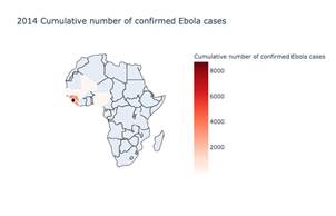
Figure 6: Choropleth map - Varying Ebola cases in African countries in 2014
Figure 6 shows the varying amount of ebola cases over the African regions under Python Plotly. Higher cases is recorded in Sierra Leone followed by Guinea and Liberia.
Figure 7 displays the varying levels of average temperature recorded across the regions. Implementation is done using Python Plotly. From the user's perspective, it is hard to visualize and compare the regions using temperature values solely on color matching only. It can be solved by the addition of labeling feature or tool tip.

Figure 7: Choropleth map - weather(Temperature) in African countries in 2014
Bubble Map display circles over the geographical locations with area in terms of values either as average or count. It also support time-series viewing by showcasing the overlapping circles along with legend clickable to hide or show.

Figure 8: Bubble map - Ebola incidents(Deaths) in African countries during months of 2014
Figure 8 shows the overlapping circles according to months - August, September and October under each year (2014). It is implemented using Python Plotly. With the bubble map, the circles are shown on their respective geographical locations/regions using latitude and longitudes. Each circle area is estimated from values of Ebola deaths count.
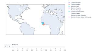
Figure 9: Bubble map with time series - Ebola incidents(Deaths)
Figure 9 is similar to bubble map with an addition feature of time series analysis. Colors are coded accordingly to the countries having Ebola incidents. Time slider is introduced at the bottom of bubble map to illustrate the patterns changes of Ebola incidents during the course of time. Size of the circle indicates the number of value counts of Ebola incidents by the area. It is developed using Python Plotly express.
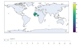
Figure 10: Choropleth map with time series weather(Average Temperature)
Figure 10 acts in a similar fashion as a Choropleth map except that it adds a time series for change in temperature over the months-year. It uses time slider where one can navigate to see temperature variations under any months of a given year. It is implemented with the help of Python Plotly.
Connection map shows the flow of information, either in the form of flights or any objects, from place to place. It is represented as straight or curved lines. While it is good for visualizing connections over the geographical areas, it also reveals the spatial distributions and where the high amount of clusters are concentrated upon.
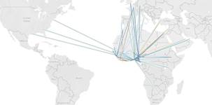
Figure 11: Flow map - flight routes from African regions to places)
Figure 11 display the flight routes from African regions to other countries as an evidence to support the cause of international trade routes that promote the spread of Ebola incidents worldwide. It uses Tableau as its visualization tool.
5.3 Experimentation
5.3.1 Missing Values and Noise
Missing values is one of major anomalies in data quality. If data is not pre-cleaned, missing values could be visible in data visualization graphs in form of gaps or holes. It thus results in bias or incorrect interpretation of data. The data visualization techniques, irrespective of the type of tools, use various approaches such as:
colored bars to highlight the missing values. It facilities easy visual distinction of imputed values. Imputation is either by median, mode or average replacement. - downplaying imputed values
annotation by using statically information with the help of error bars and confidence levels
information removal by dropping missing values completely From the observations, the [6] reveals that highlighting imputed values or annotating onto graphs or plots leads to better accuracy and ease of data discerning. Moreover, it depends on the type of imputation methods used.
Plotly Express doesn't allow visualizing missing data, so it restricts to imputation or removal of information. While Tableau has more flexibility and allows to visualize missing data. Also, Tableau have Data Interpreter which facilities the data cleaning support in-built.
5.3.2 Real-Time Data Streaming
Plotly couldn't facilitate the real time streaming however it can make static data visualized in time frame animation. While Tableau supports real time streaming of data via Javascript API with a web portal or SQL database with an option of refreshing every 'n' number of seconds. It has to be noted that Tableau is not data monitoring tool but acts only as data analytic tool, for instance take the case of stock market.
5.3.3 Creation of reports
Tableau creates reports in form of dashboards which combines one or more sheets ( or graphs) either time-series or not. Such dashboards also handle filtering and paging for time-series plots.

Figure 12: Dashboard creation using Tableau
5.3.4 Statistical Data Manipulation
Tableau has a limited statistical data manipulation while Plotly have the advantage of dealing with statistical data views.
It is widely known that Tableau is mainly a visualization tool. It can perform basic operations of statistics such as mean, median, variance, skewness etc. The downside is that Tableau couldn't do deep learning as well as machine learning algorithms such as ARIMA ( Moving Averages ), Decision Trees, clustering, outlier detection etc.
To overcome the above challenge, Tableau can be integrated with Python or R or related programming language to perform advanced statistical operations.
6. RESULTS
Mapping data to visualization requires a skill. Depending on the type of audience and the data complexity, the right technique should be able to prove its purpose as well as creating insights.
Classified on the following various visualization approaches:
6.1 Comparison
When one wants to compare among items over static or non-static time series. It assists in comparison between the old and new trends. Additionally, it answers to 'what are the countries that have highest Ebola incidents', 'how Ebola incidents vary across the time periods?'.
6.1.1 Over Time
Line chart is best represented using time series analysis of data, with the ability of handling many categories. Bar chart can be the alternative. Radar chart works best for cyclic data due to its cyclic feature, while the line chart in case of non-cyclic data.
6.1.2 Over items
Depending on the number of categories the data contains, the right chart type is chosen. The horizontal or vertical bar chart is chosen for a few number of categories. Embedding charts within a table is fit under many categories.
6.2 Composition
Composition defines how much each sub region or part is compared with that of its whole. It can be represented as absolute differences or percentage or other metrics.
6.2.1 Static
Pie chart is most commonly - used type of chart however, it doesn't display clearly for many categories. Stacked bar chart can be relevant to show the components of the component. Additionally, tree map is not much heard of and it can support this feature where total can be split into boxes in terms of total or absolute differences.
6.2.2 Non-static
Over the changing time series, either stacked bar chart or stacked area graph can be useful based on the number of data categories.
6.3 Distribution
It helps in viewing the distribution of variables along the axis or over the time. Looking at the data shape, one can view the characteristics of data such as central tendency, outliers, as well as the range of values. For instance, take the number of Ebola incidents per country group. It also helps in identifying the trends.
6.3.1 One data variable
Histogram in form of bar chart can illustrate the frequencies of variables, since it can handle few data points. Line chart holds best for many data points across the axis or across the time series.
6.3.2 Two variables
Scatter plot is best suited for displaying many data points to determine the spread, its characteristics and relationship between two variables.
6.4 Relationship
Relationship is used to determine the relationships between the data points and find the correlation analysis, data clustering and perform outlier detection. Further, if one want to find the relationship among the ordinal or nominal data points. In case of Ebola studies, the data scientist use the relationship charts to test the correlation between the factors such as international air travel, health care workers incidents with the Ebola incidents.
6.4.1 Two variables
Scatter plot can be chosen to determine the relationship between two variables.
6.4.2 Three variables
Bubble cart includes a third variable where size of a bubble represents the ratio or size as a way to encoding the data appropriately.
7. CONCLUSIONS
It is concluded that data visualization provides perception that the traditional descriptive statistics could not. Also it enhances the speed of the decision making in the competitive world. It aides the understanding of vast amount of data with the use of visualization approaches.
Tableau is considered as an useful technique when comes to visualizing data in different forms. On the other hand, various programming languages provides information related to statistical details and allows data manipulation statistically. However, integration of Tableau with Python or R out weight its advantages so it is widely chosen as feasible technique to use.
The developers that have experience with Python / R may underestimate the value of powerful visualisation tools such as Tableau, Bohek, Microsoft Power BI to name a few. To expand the boundaries and to discover new tools will definitely be more of help and make their tasks easier than they expected.
This paper focuses on the main objectives - identifying the factors behind the Ebola incidents and its spread, find the various techniques to visualise the data patterns, and develop the dashboard using visualization techniques to analyse and understand the spread of Ebola cases.
Spread are impacted due to international air travel, health care workers that are been infected as well as weather conditions.
Finally the study has analysed different factors contributing towards the Ebola spread using dashboards.
8. REFERENCES
[1] Carroll, L., Au, A., Detwiler, L., Fu, T.-C. J., Painter, I., and Abernethy, N. Visualization and analytics tools for infectious disease epidemiology: A systematic review. Journal of biomedical informatics 51 (04 2014).
[2] Lee, K., Agrawal, A., and Choudhary, A. N. Real-time digital flu surveillance using twitter data.
[3] Matsumoto, R., Yoshida, M., Matsumoto, K., Matsuda, H., and Kita, K. Visualization of the occurrence trend of infectious diseases using twitter. In Proceedings of the Eleventh International Conference on Language Resources and Evaluation (LREC 2018) (Miyazaki, Japan, May 2018), European Language Resources Association (ELRA).
[4] Odlum, M., and Yoon, S. What can we learn about the ebola outbreak from tweets? American journal of infection control 43 6 (2015), 563–71.
[5] Reeder, B., Revere, D., Hills, R. A., Baseman, J. G., and Lober, W. B. Public health practice within a health information exchange: information needs and barriers to disease surveillance. Online journal of public health informatics 4, 3 (2012).
[6] Song, H., and Szafir, D. A. Where's my data? evaluating visualizations with missing data. IEEE transactions on visualization and computer graphics 25, 1 (2018), 914–924.
[1] https://www.kaggle.com/open-flights/flight-route-database
[2] https://www.kaggle.com/open-flights/ flight-route-database
[3] https://www.cdc.gov/vhf/ebola/history/
[4] -2016-outbreak/index.html
[5] https://data.humdata.org/dataset/number-of-health-care-workers-deaths-by-edv
[6] https://www.ncdc.noaa.gov/cdo-web/
[7] www.en.wikipedia.org/wiki/Geographic_information_ system
Cite This Work
To export a reference to this article please select a referencing stye below:
Related Services
View all


Related Content
All TagsContent relating to: "Infectious Diseases"
Infectious diseases are illnesses caused by organisms such as viruses or bacteria that are passed either directly or indirectly from one infected host (e.g., a person or animal) to another.
Related Articles

DMCA / Removal Request
If you are the original writer of this research project and no longer wish to have your work published on the UKDiss.com website then please: