Design, build and User-test a Curriculum Vitae Mobile Application for Software Developers
Info: 3239 words (13 pages) Dissertation
Published: 13th Dec 2019
Tagged: DesignInformation SystemsInformation TechnologyTechnology
Table of Contents
2. Review of Literature / Background
3. Methodology/Sources of data
1. Introduction
The purpose of this project is to document the need of a Curriculum Vitae (CV) generator mobile application and further design, develop and user-test its prototype for the Android platform by considering accessibility, usability and readability, and how these aspects should bind with each other into User Experience (UX), User Interface (UI) and the overall design of the implementation to reach the requirements of replacing a paper-based CV.
The project is looking to answer the following research question “Will the implementation of a Curriculum Vitae Mobile Application prove useful for the Software Developer role job seekers?”.
Because in the past 5 years, mobile devices usage has shown an incredible growth, these becoming even more portable, ubiquitous, and pervasive, and in 2014, overtaking desktop global usage, there is a larger need of portable omnipresent software. (statistics ref here)
The idea of such an implementation came during a process of job seeking and CV creation. Because a CV contains data like phone numbers, emails, locations and photos, this suggested that the project could be a valid fit in the Mobile Applications Context, as a modern phone’s capability is to make calls, send emails, access maps and take photos through built-in hardware. Also, a fast CV creation process would be convenient for a job seeker.
To conceive and design a mobile application, it is of high importance to establish a target audience, understand how potential users think, why and how are they using the application, and more importantly what they want to see in the application, including content and features. (ref here)
The application is addressing to individuals from any background that might prefer to create a Curriculum Vitae on a mobile device, but it is built from a Computing graduate’s perspective with Computing and Information Technology (IT) graduates’ vision over a winning CV in mind.
The MobileCV application aims to help this target audience and enable the users to produce and edit their CV under any circumstance, as long as they are in possession of a mobile device, efficiently taking advantage of any employability chances that may occur in they’re life.
The study relies on an original Review of Literature, a Primary Research structured in two parts (pre-prototype for confirming main structure, design and features, and post-prototype for user-testing and potential bug fixes), a Secondary Research represented by early information/ feedback gathering, and the prototype implementation itself.
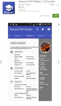
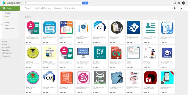
To demonstrate that the project is within a good area of research the Secondary Research has relied on a Google Play market analysis on a “CV” search which showed that such implementation has been developed by others, but a considerable amount of published applications is outdated in terms of design, lacking usability and offering poor UX and UI.
The MobileCV is a unique and unconventional approach to an independent study as the Review of Literature had to be remodelled compared to a classic approach where sources that straightforwardly relate and fit the subject of a study.
2. Review of Literature
The Review of Literature is the most challenging part of this study as there is no available academic work or literature previously published that could directly relate to the topic. This proves that this is a good subject within an unexplored area of research. Also, a potential gap in the market might have been identified concurrently with the entire scope of the project, which proves again the idea is valid and could be beneficial to more areas and domains, as will be described later.
Therefore, this is structured in the form of a parallel showing the similarities of a winning Curriculum Vitae and a successful mobile application, relying more on the project’s core, the Primary and Secondary Research’ findings that firstly validated the MobileCV idea, to act as replacement for the absent literature.
According to (Highens., 2013, p. 2-3), the majority of people think that the process of CV creation is easy and they should be able to “knock up a CV in a couple of hours”, and this can be acquired as long as an optimal quality is achieved, suggesting that a candidate which might be slightly unexperienced and not as good for the role but presents a better CV, has an increased chance to win over an employer, rather than a more experienced individual presenting a poorer CV. Also, a person should spend “as long as it takes” to design and tailor a CV to suit the prospective job role and the person’s preferences.
This is where the MobileCV project aims to help its target audience, individuals that are living in these fast-paced times and might need a CV, but don’t have the necessary time and resources to mix for obtaining a perfect, job winning product. The application is going to put together a well-researched pattern to follow for creating a universal design to reach a good part of the job seekers wishes. This study is not focused on the effective content that should be in winning CVs, but more on how these should be structured and designed electronically, and key sections that should be included with it.
Nowadays, most of the activities that people undertake are intended to be as fast and simple as possible, as they live in an era of speed, with continuously evolving predictive technologies and ways of easing their life. This can relate to job recruiters for example, in the United Kingdom (UK), job recruiters spend 3 minutes on average to analyse a Curriculum Vitae, 25% of the test subjects taking less than a minute to decide over the winning one, especially on those coming from recent graduates. http://www.huffingtonpost.co.uk/swatee-jasoria/cv-advice_b_8195050.html
A Curriculum Vitae should not cover more than a single A4 page, including information on both facets if this is required. https://www.kent.ac.uk/careers/cv.htm A one-page CV is the suitable approach the contemporary candidate should use, as this is “quick and easy for the employer to read” being appropriate for online use (you hired p117), concurrently with the bigger technology use and given the fact that most of the daily activities (e.g. mail, news, TV) are now executed increasingly online.
The common point of the main pieces of literature forms the following set of rules a CV should have a concise, to the point layout, that is well structured, and follows a logical order. (graduate… p 208, one page p.11) (creative cv. P 9)
This can relate to the overall usability, accessibility and readability offered by an exceptional modern mobile application’s UX and UI, as will be described later on.
There is also a common and proven fact that 40% of the UK’s job recruiters tend to interview candidates that present a creatively designed CV, over a classic old fashioned CV, as long as this type of CV is suitable for the desired role that the candidate is applying for. http://www.huffingtonpost.co.uk/swatee-jasoria/cv-advice_b_8195050.html
The CV generated by the MobileCV application is going to be structured in this creative specific way towards suiting and meeting both candidates and potential employers’ trendy requirements.
Therefore, a set of universal, but not mandatory, rules has been crafted by various specialists within the Creative Industry like Design Consultants, Creative Directors and Art Directors, and laid on paper as a good of practice reference for the layout structure and overall design guidelines, as it follows.
The candidate’s personal details section comes first in the layout and should include only essential details such as; photo, name, address, telephone number, email, a short biography (bio), a list of interests and if applicable, a link to the candidate’s website or online portfolio.
These can relate to modern mobile devices’ capabilities, as they offer ways to gather user input, locate an address, place calls, send emails, take photos and navigate the Internet through a vast range of Application Programming Interfaces (API) found in close linkage with the hardware and high precision sensors possessed by the device, such as; Touchscreen, Geolocation through Global Positioning System (GPS), Data Network and Wi-Fi, Camera etc. https://www.cs.cornell.edu/~tanzeem/pubs/mobile_phone_survey.pdf
Moreover, this proves that a mobile application that can act as a CV, generate and edit copies of one is suitable for the Mobile Application Ecosystem and fits well and the Mobile Application Context.
As employers tend to ask for sets of various skills in their job role description, it is crucial to add skills sections, which are supposed to fit the employer’s need, separated as it follows: technical skills for the role’s core requirements, tools and instruments skills for what might be involved to fulfil the core requirements and interpersonal skills which can include social, team, communication and more aptitudes that might not directly be involved in the role, but might arise whilst working.
The importance of the education/ qualifications section is disputable, as it has been proven in the past that people did not undertake any higher education could be successful in any types of industry. Although, it is still useful to be included especially if the candidate has a degree, this being of interest for most of the recruiters and employers.
Foremost, employers are highly intrigued by and interested in the experience section which should be included, even if most young candidates do not benefit of large experience, the solution for this being backed up by both including the above-mentioned portfolio and considering any freelance project or piece of work, no matter how small it is. (creative p 3-7)
Consequently, the generated CV will be a one-page creative type as it is estimated 30 seconds to draw the employer’s attention (creative p8), ensuring that the employer further studies the candidate’s application as it will be standing out from the crowd. (creative p13)
A mobile application consists of two closely related crucial aspects, User Interface and User Experience. The User Interface is represented by all the visual elements that can be found in the application whilst the User Experience means the effective experience that the User Interface delivers to a user. (ref here)
According to (Nielsen 2012) usability is defined and influenced by how easy a user can operate with the UI, how efficient is the design as a whole, in terms of the artefact’s UI and the UX that this delivers, how easily a user can remember how to operate with the UI and how pleasing this activity can be. https://www.nngroup.com/articles/usability-101-introduction-to-usability/
Luckily, there are already existent usability international guidelines provided by the World Wide Web Consortium (W3C) and mobile devices Operating System (OS) manufacturers, like Android. https://developer.android.com/design/index.html
According to W3C https://www.w3.org/WAI/intro/accessibility.php, accessibility is not only about how a software artefact should ease and simplify its design for disabled users, but also about flexibility in design, coming in the help of all users’ necessities.
Based on a Nielsen Norman Group article https://www.nngroup.com/articles/legibility-readability-comprehension/ , readability is strongly related with legibility and comprehension, meaning a close binding between a legible typeface (modern sans-serif fonts proving to have increased legibility over serif fonts, when displayed on devices’ screen), simple wording a general user-familiar language to be used across a piece of software.
Not only a successful mobile application, but any software product should be usable, accessible, and readable, offering an outstanding suggestive, intuitive satisfactory User Experience throughout its entire User Interface to all its users. http://www.lexjansen.com/wuss/2004/data_presentation/i_dp_design_principles_for_o.pdf
This is where similarities between the basic structure and layout of a CV and the overall design of a mobile application can be found.
As found previously in this review, the designated CV model is concise and tidy, this translating into the mobile accessibility and readability, offering the user an easy accessible design and ensuring that content is readable.
The creative type of the researched CV model is relating to the usability of the mobile application through the way this is structured itself, offering a clear and well-ordered layout, that should deliver ease of use to the user across the application.
As both a CV and a mobile application should be suggestive through brevity and completeness – readability and accessibility and, structure and aesthetics – usability, these blending perfectly into UI and UX, it is a priority to find and document the ‘perfect fit’ in what concerns the design and development process that is going to follow the preliminary research.
As stated before, the MobileCV targets Google’s Android OS application market, mainly because currently the implementation could not be tested on Apple devices and some more training is required for the process of publishing iOS mobile applications.
Currently Google provides a wide range of resources https://design.google.com/resources/ to help developers respect the UI and UX design guidelines for Google’s device-unified approach included with the Android OS, namely Material Design. https://material.io/
Material Design relies on a 3D space, that simulates the real world, giving UI elements physical alike properties as elevation to show a depth-of-field effect and soft large shadows to delimitate UI elements. It aims to simulate a unified UX, an interaction similar to the one found on real objects feel is intended when a user comes into contact with the design objects. It offers a well-designed suggestive UI elements, readability-optimised typography and icons, all wrapping up into delivering a highly detailed accessible UX to the user.
Because deploying to both Android and potentially iOS (in the future) platform is desired the best way to provide a quick and efficient solving to a Native application barriers, in terms of making use and knowledge of platform-specific programming languages (especially Objective C or Swift on iOS), and its more time-consuming long planning-ahead development process, was a Hybrid Application development approach. Hybrid application benefit such a project as they are cross-platform, relying on more knowledgeable web technologies development language (HTML5, CSS3 and Javascript) to access the mobile device and some of its features, all summing up in a time-efficient development process.
The open-source Cordova Hybrid mobile applications framework (Cordova, 2017) might have limitations in what concerns the WebView wrapper not offering a native alike UI and some native device features being hard to access. Even though, there is set of tools like the open-source Google Angular Material (angularmaterial), built on top of AngularJS(angular), being popular for its capabilities in building dynamic web applications also offering the required native UI, designed and supervised by Google itself. Also, the ngCordova (ngCordova) is a Cordova wrapper that will help to integrate and blend Cordova framework and with the Angular Material service. (Ionic in action p 1-16)
This is of great importance for the prototype implementation as Cordova opens a path to the future with the cross-platform capabilities, in this way the MobileCV application is future-proof and supports potential expandability over other mobile applications markets like Apple iOS or Windows Phone. Angular Material is strictly respecting the Google Material Guidelines which is used with the Android OS, the real advantage of this being the fact that the framework itself respects both W3C’s and Android’s UX and UI design principles in terms of usability, accessibility and readability. This is a crucial aspect as little to no effort has to be put into ensuring that an artefact with Angular Material on its basis is usable, accessible and readable, delivering an outstanding modern UX and UI to “users of all abilities, including those with low vision, blindness, hearing impairments, cognitive impairments, or motor impairments” and “enhancing the usability for all users”. https://material.io/guidelines/usability/accessibility.html#accessibility-principles
In terms of
According to https://stories.uplabs.com/what-happens-when-an-apple-guy-explores-material-design-cb739c49ca2d Google Material Design started to take over Apple’s design approach and this could highly contribute to unifying UI and UX across the two ruling OS platforms. This means that if in the future, the MobileCV application would extend to the iOS App Store, there is a high possibility for little to no necessity of changing the design of the app when doing so, confirming the above mentioned well-tied development pattern.


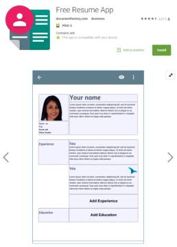
For example, the highest rated application, “Free Resume App” offers a simple boxed design and hasn’t been updated since 2016.
Cite This Work
To export a reference to this article please select a referencing stye below:
Related Services
View allRelated Content
All TagsContent relating to: "Technology"
Technology can be described as the use of scientific and advanced knowledge to meet the requirements of humans. Technology is continuously developing, and is used in almost all aspects of life.
Related Articles
DMCA / Removal Request
If you are the original writer of this dissertation and no longer wish to have your work published on the UKDiss.com website then please:


